Stratum 2.0 is a vast UI design kit and design system for Figma with super flexible configurable UI components, helpers, and screens. Kickstart any UI project, have fun and be more valuable as a designer.
Complex product design or quick high fidelity sketch of an idea.

1,000,000+
possible components variations by using variants and properties
Every design project has a starting line. With Stratum, it’s further ahead.
Built to empower everybody who designs
Sidestep creative block, sparking inspiration even on tough days.
Present top-notch mock-ups faster, and leave your clients in awe every single time.
Gain recognition, standing out with consistently impactful designs.
Use the premium feel of your designs to justify, and even increase, your pricing.
Deliver consistently high-quality projects, ensuring repeat business and glowing testimonials.
Save costs by showcasing professional mock-ups and designs in less time.
Make some neat UI before coding.
Start with a strong foundation and face fewer UI bugs down the line.
Boost your project value with visually stunning interfaces.
Quickly create an eye-catching presentation of your ideas that make stakeholder buy-in a sure bet.
Minimize the dreaded back-and-forth and misunderstandings in handoffs.
Facilitate smoother project flows with unified design resources.
Launch with a look that resonates and builds instant trust.
Give your startup a polished UX and look from day one.
Achieve top-tier design without a big design team or budget.
Equip your team with high quality toolkit in the Figma environment and build faster.
Reduce the number of minute decisions, allowing for a focus on the broader product vision.
Smoother and faster collaboration between co-workers.
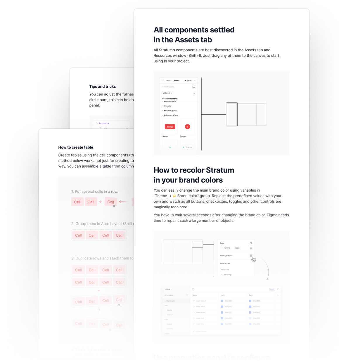
Bypass the typical learning curve and create the first flexible top-notch UI design straight after opening Stratum, thanks to an intuitively organized structure.
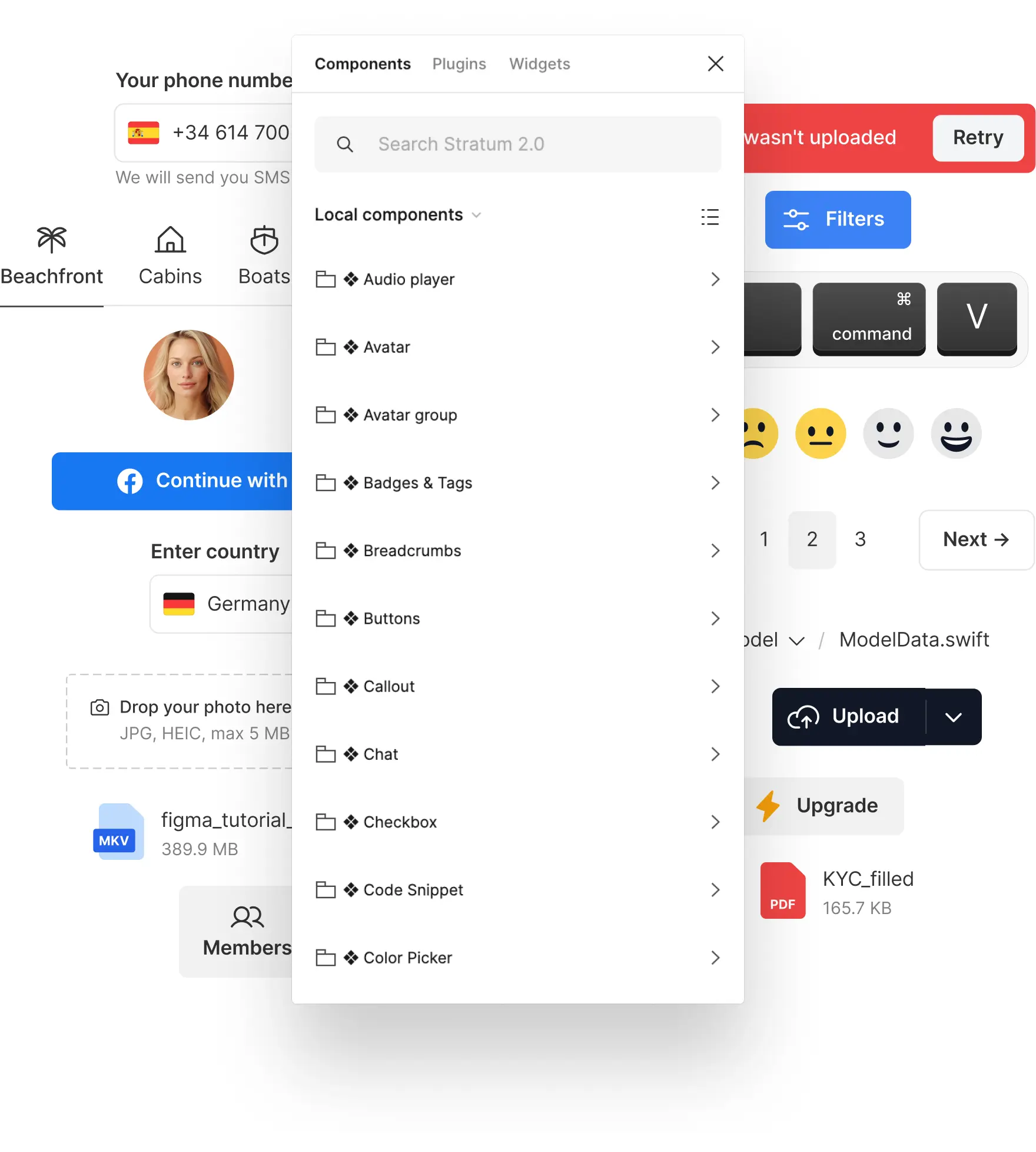
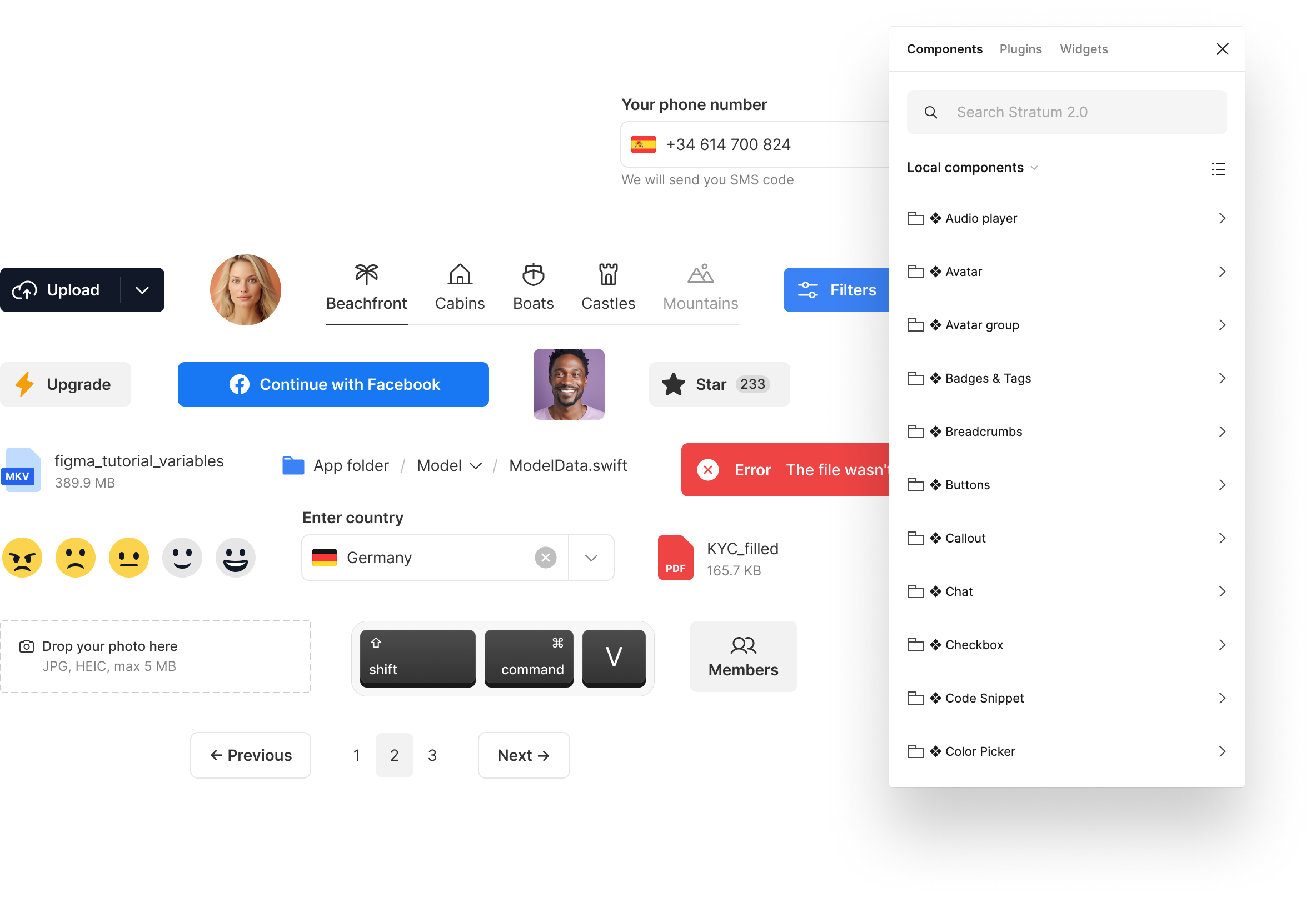
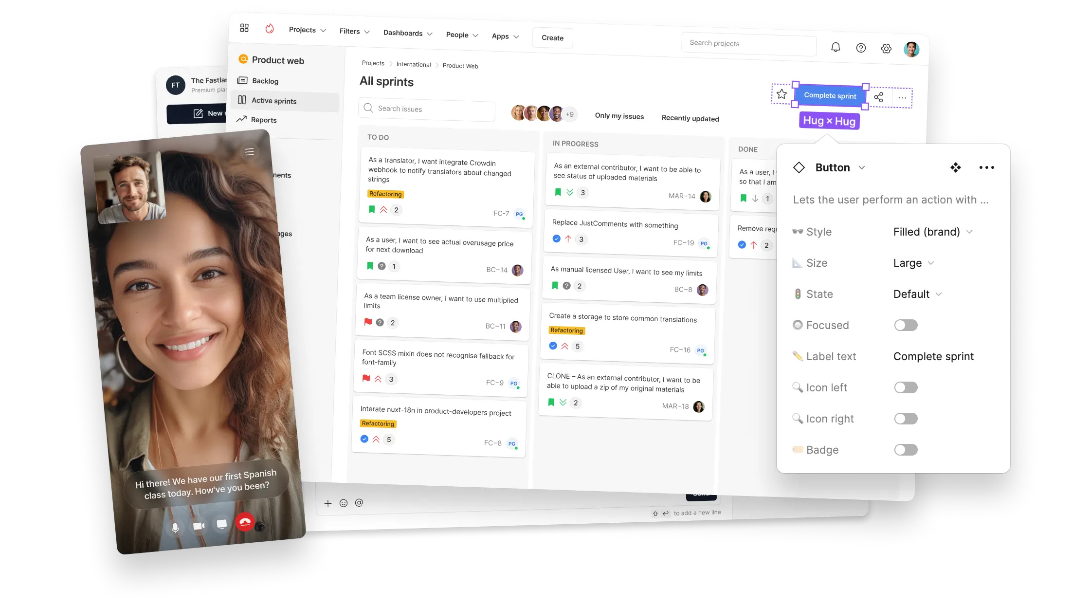
Easily align everything with the project’s brand and your specific design vision. A couple of clicks to automatically apply your brand color to each component. Icons have a 24×24px frame size, so you can easily replace them with any popular icon packs. Everything is adapted to tweak and change.
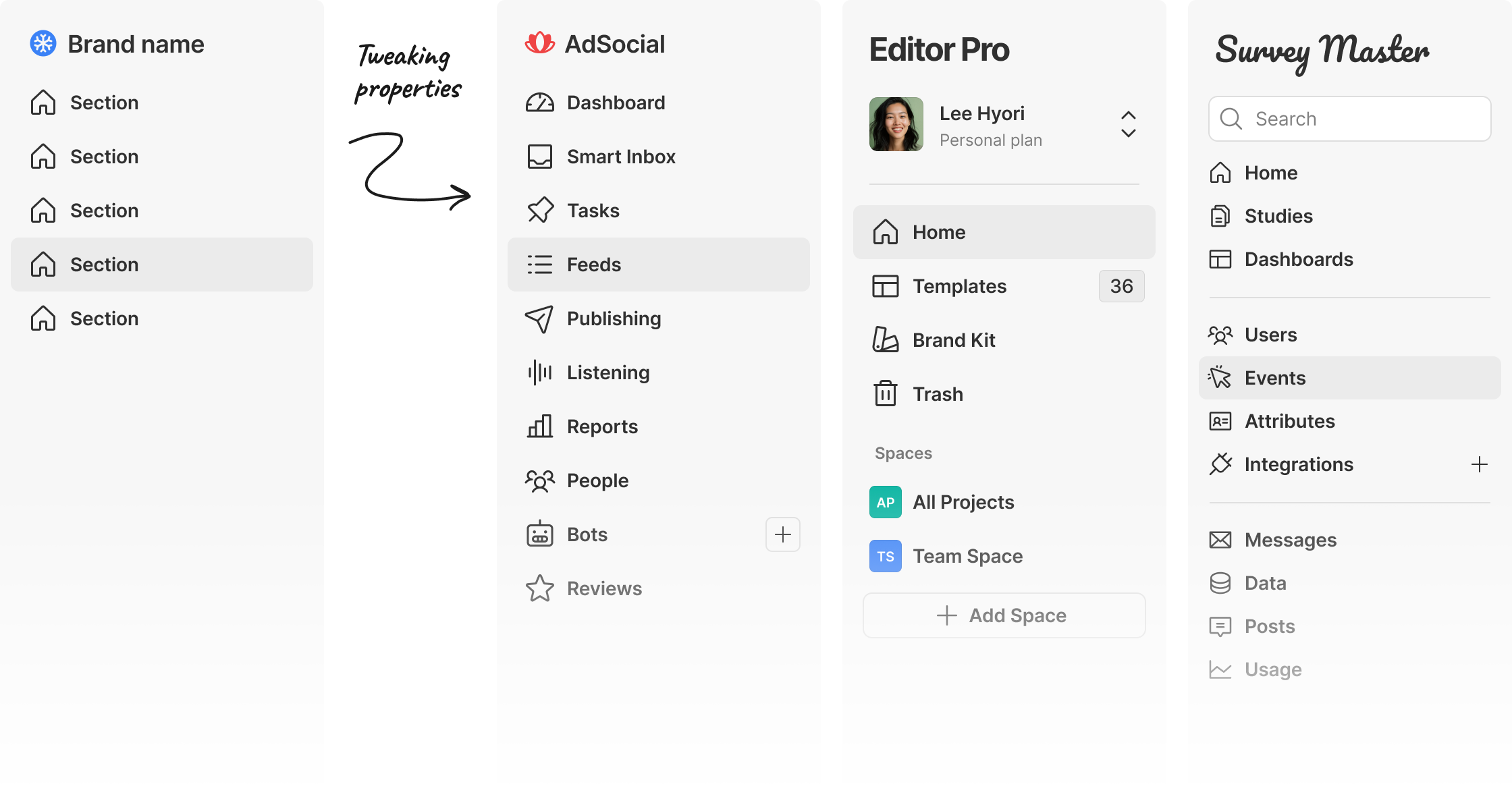
Toggle, mix, and change styles without the need to switch between different UI kits, ensuring a smooth and easy-to-pivot UI design process.

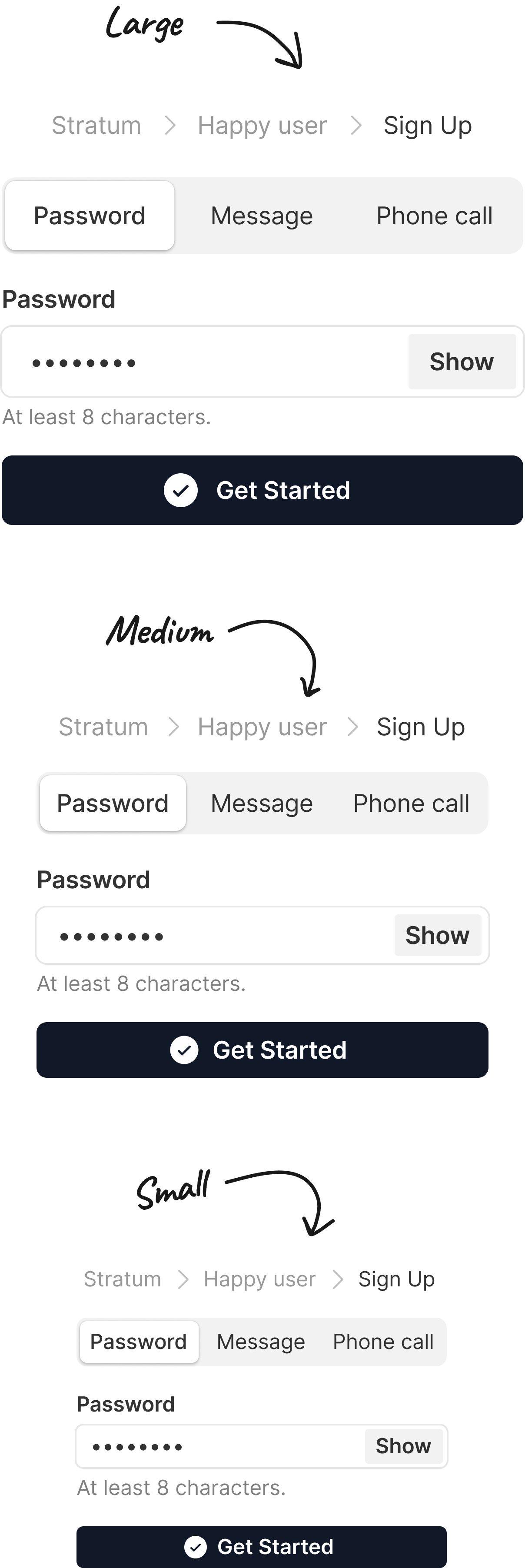
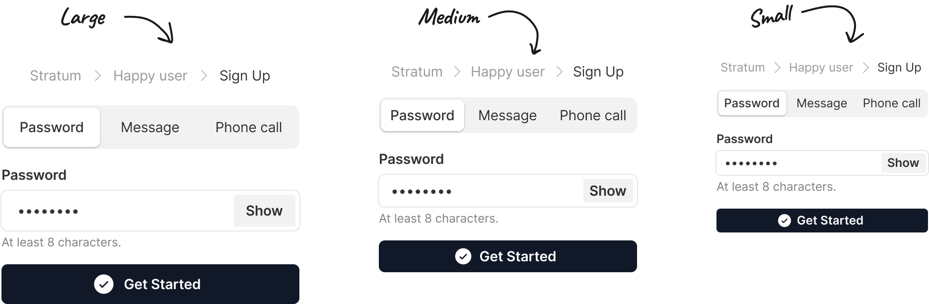
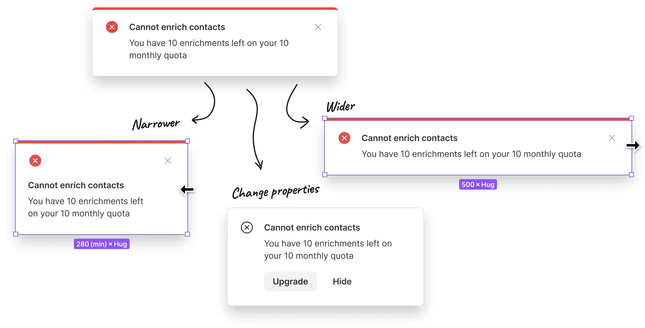
With three distinct controls sizes, ensure a harmonious and proportionate layout regardless of the information density or device. Adapt your designs to various screen sizes and pro needs without the hassle of resizing each element manually.
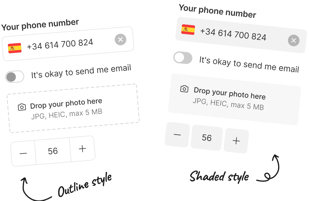
Quickly switch between outline and shaded control styles to best fit your project's aesthetics. There is no need to switch between different UI kits — get the best of both worlds in one comprehensive package. Easily change style even after finishing the whole design project.

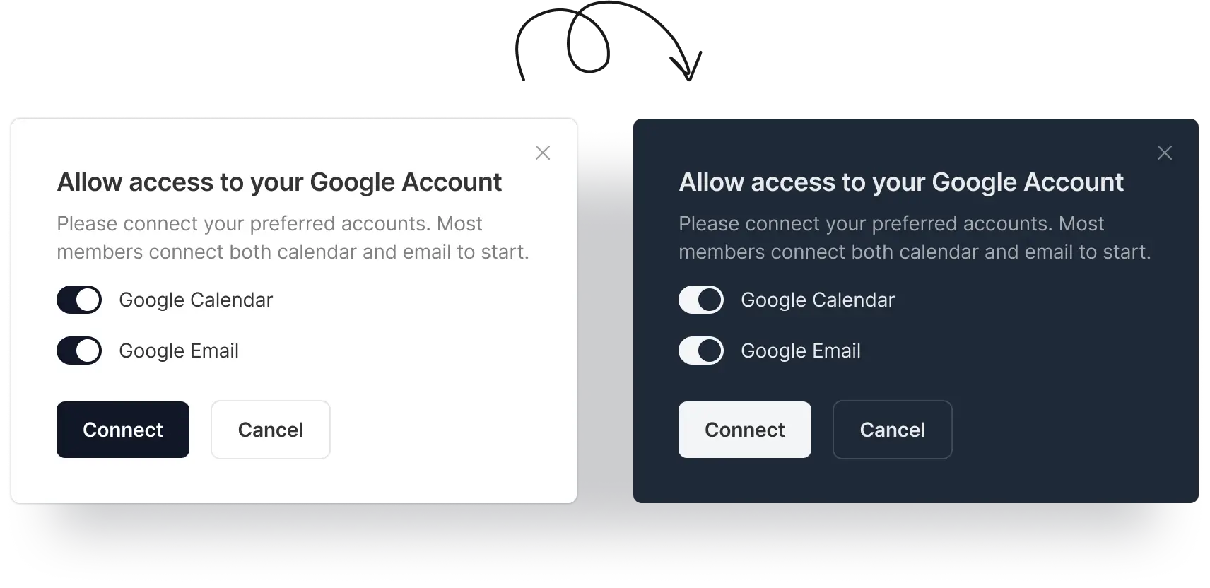
Have light and dark themes switching at your fingertips, quickly adapting to project needs and changing design trends. Any design you create will automatically have both themes.
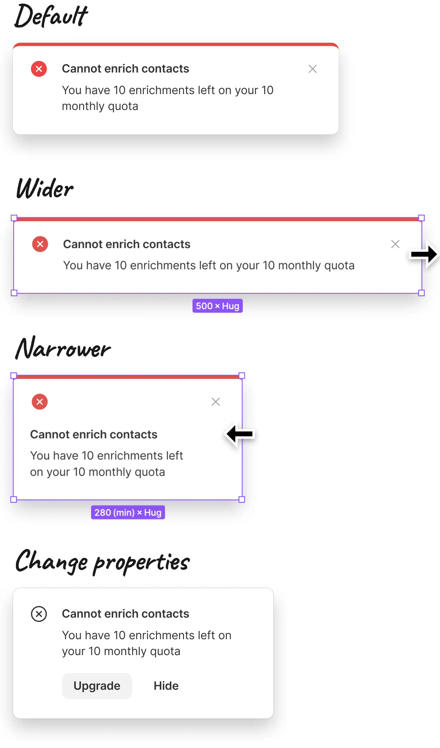
Experience stress-free resizing and editing as components automatically adjust to size changes, text lengths, etc., ensuring aesthetic integrity.
Pixel-perfect, progressive 2-4-8px grid, consistent controls, atomic approach, best practices by default. Interactions at the micro level are meticulously thought out.
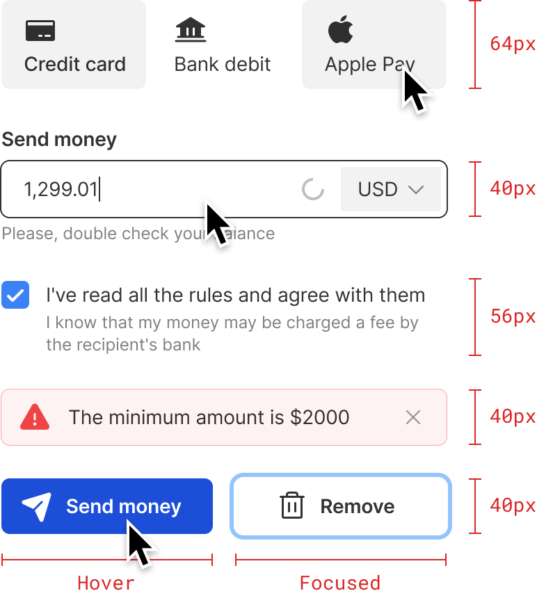
Hovers, active, disabled, focused — all the possible states and variations. Your projects will have the highest design standards from the start.
Unlock the full power of the Stratum and eliminate guesswork with clear, step-by-step guidelines on every aspect. A lot of tips and tricks are also included.
As the design world evolves, Stratum evolves with it, providing a consistent and up-to-date toolbox for all your design endeavors. Invest once and stay at the forefront of design trends and best practices with continuous updates.
Dive right into your designs with example layouts, giving you a head start and sparking creativity. Desktop and mobile versions included.
Free updates for life. No-questions-asked 14-day refund. The price increases after every major update.


This is some impressive work and a truly thought-out system. The level of instances and overall flexibility will change the game of consistency.
Stratum UI Design Kit is an excellent way to speed up wireframing or product design. With dozens of reusable elements built with the latest Figma features like Variants and Auto Layout, you can skip the dull work and get straight to problem-solving. Stratum’s clean design looks great as is, but may also be a solid foundation for your design system.
I highly recommend it for any designer to use either as a UI kit or incredible starter for your own next design system.
Stratum 2.0 is a Figma file that includes a design system and a super flexible configurable UI kit with a library of consistent UI elements, helpers, and screen examples. With Stratum 2.0, interface creation in Figma is greatly speeded up and turns from drawing into a lego-constructor.
You'll be emailed a download link for a zip file with the necessary files and a step-by-step guide. This email will also contain a receipt, which you can edit and fill in your details using a simple web editor.
If you're unhappy with your purchase for any reason, email me at hello@stratumkit.com within 14 days and I'll refund you in full, no questions asked.
No specific level is needed. In fact, Stratum is a great way to learn Figma. All key features can be immediately seen applied in a real design system.
New UI components, adapting Figma's latest features, corrected defects, improved current components, and new screen examples. Everything will be totally free for existing customers.
Yes! You can use Stratum for basically anything — the only things forbidden are using it to create derivative competing products and redistributing.
Write to hello@stratumkit.com. I'm always happy to answer any questions and get feedback.
